Brand Guide · v1.0
Blake Hicks
Brand Kit
Blue and white. Vaporwave grid, neon glow, 80s arcade type. Everything here is an SVG you can drop into Canva, Premiere, or a print file.
Concept
Light on a dark floor
The brand is the show: a single rider made of light spinning in a blacked-out arena. So the palette is almost entirely dark navy with blue-cyan light on top, and white for clarity. The 80s references — perspective grid, striped horizon sun, chrome type — come from 80s sci-fi and outrun art, but stay blue. LED Blue is the signature logo color, with Electric Pink as the alternate; the cyber gradient (cyan → blue → violet → pink) is reserved for the bike icon, the tagline rules and neon moments.
Voice
Confident, high-energy, plain-spoken. Short sentences. Talk to event producers like a pro who's done 500 shows — because he has. Never gimmicky; the bike does the wow.
Say: LED Bike Show · LED bike · flatland · halftime · self-lit · self-contained.
Avoid: "stunt show", "bicycle", "cool", exclamation marks in body copy.
Logo
Wordmark, stacked & monogram
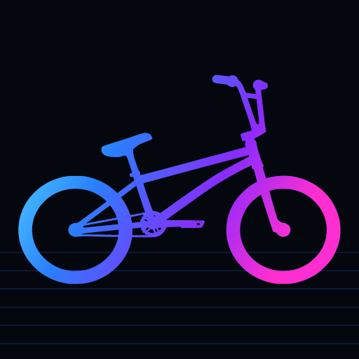
Set in Orbitron Black, converted to outlines. Use the horizontal mark in nav bars and lower-thirds, the stacked mark for posters and social tiles, and the bike icon (traced from the brand silhouette) for avatars, favicons and small spaces. Every mark comes in LED Blue and Electric Pink; the neon and cyber versions are for dark backgrounds, with only a soft glow so the letters stay crisp.
 wordmark-stacked-neon.svg
  wordmark-stacked-neon-pink.svg
  wordmark-stacked-cyber.svg
  wordmark-stacked-blue.svg
  wordmark-stacked-pink.svg
  wordmark-stacked-white.svg
  wordmark-stacked-black.svg
  avatar-512.svg
  wordmark-horizontal-neon.svg
  wordmark-horizontal-neon-pink.svg
  wordmark-horizontal-cyber.svg
  wordmark-horizontal-blue.svg
  wordmark-horizontal-pink.svg
  wordmark-horizontal-white.svg
  wordmark-horizontal-black.svg
  monogram-cyber.svg
  monogram-blue.svg
  monogram-pink.svg
  monogram-white.svg
  monogram-black.svg
 Do
- Keep clear space equal to the height of the "B" on all sides.
- Minimum width: 120 px / 30 mm for the horizontal mark; 32 px for the monogram.
- Use white or neon on dark; blue or black on light.
- Pair with the bike lockup when there's room.
Don't
- Don't re-type the name in another font — always use the outlined SVG.
- Don't add drop shadows other than the supplied glow.
- Don't recolor to anything outside the palette.
- Don't stretch, rotate, or put it on busy photos without a navy overlay.
Color
Palette
Ratio guide: ~80% navy, ~12% white/ice, ~8% blue & cyan. Contrast: Ice on Deep Navy 14.6:1; LED Blue on white 3.6:1 (large text only — use Deep Blue for small text on white).
Typography
Orbitron + Space Grotesk
Display — Orbitron 900 / 600
LED BIKE SHOW
HALFTIME · FESTIVAL · ARENA
Always uppercase, tracking +4% (900) or +20–30% (600 labels). Headlines, buttons, eyebrows, stats. Google Fonts (OFL) — self-hosted in /fonts.
Body — Space Grotesk 400 / 500 / 700
World-class flatland BMX on a bike wrapped in light.
Sentence case, 17 px base, 1.6 line-height, max 65 characters per line. Slightly geometric so it sits comfortably next to Orbitron. Google Fonts (OFL).
Iconography
The bike
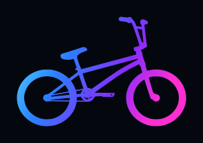
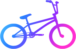
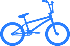
The bike icon is traced from the brand BMX silhouette. Use the solid LED Blue or Electric Pink versions like a logo, and the cyber-gradient and neon versions on dark backgrounds. bike.svg uses currentColor, so it takes whatever text color it sits in.
 bike-neon.svg
  bike-cyber.svg
  bike-neon-transparent.svg
  bike-blue.svg
 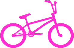 bike-pink.svg
  bike-white.svg
 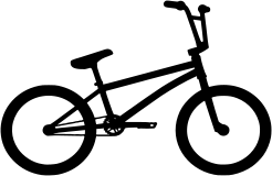 bike-black.svg
  wheel.svg
  wheel-neon.svg
  lockup-neon.svg
  lockup-neon-pink.svg
  lockup-cyber.svg
  lockup-blue.svg
  lockup-pink.svg
  lockup-white.svg
  lockup-black.svg
 UI glyphs (24 px grid)


Graphic devices
Grid, sun, scanlines, glow
Perspective grid
Bottom of hero sections only. Fades to transparent at the top. Animates slowly toward the viewer; respects reduced-motion.
Striped sun
A blue radial glow with horizontal cut lines, sitting on the horizon behind headlines. Never pink.
Scanlines
2.5% white lines every 3 px on hero and CTA blocks. Subtle CRT texture; don't put it over video.
Line graphics
Circuits, waves, streaks, skyline
Four SVG graphics in src/components/Deco.astro, drawn to match the cyberpunk reference boards. They sit behind content at 30–60% opacity and animate (line-draw, node pulse, flowing dashes, window flicker); all motion stops under reduced-motion.
Social
Templates
Avatar 1:1 — avatar-512.svgNEW SHOW DATE